
Rigo
Colombian Coffee
Rigo Coffee
Art Direction, Illustration
COL

Rigo - Illustration for Packaging
The Concept: A Visual Celebration of Rigo’s Life and Coffee Heritagetion
The design direction focuses on bold, immersive illustrations that weave together Rigoberto’s story and the beauty of Colombian coffee.
The Challenge:
RIGO needed packaging that stood out on shelves while capturing its bold and energetic brand identity. The design had to balance eye-catching visuals with clear product information.
The Solution:
A custom illustration style was developed to reflect the brand’s personality, combining vibrant colors with dynamic compositions. The artwork enhances shelf appeal while ensuring brand recognition across different product lines.


Color Palette:
The palette balances bright, energetic tones with contrasting shades to create depth, making each product stand out while maintaining a cohesive brand look.
Overview:
The visuals are the hero of the packaging, and each blend celebrates a different chapter in Rigo’s life, using landscapes, cycling imagery, and distinct colors to create a compelling and memorable experience.
The Style:
Flat, bold illustrations with textured details—modern yet approachable.
Inspired by Colombian landscapes, European mountains, and Medellín’s vibrant streets.


Urrao Blend – Morning Espresso
Colors:
Yellow, Blue, and Red: Symbolize the Colombian flag, representing Rigoberto Uran’s roots and national pride. Bright Yellow: Highlights optimism and the energy of new beginnings.
Landscape:
Depicts Urrao, Rigoberto’s hometown, with colonial houses stacked atop the hill. The uphill road reflects the hard work and perseverance that started his cycling journey.
The cyclist is climbing uphill, symbolizing determination, hard work, and the early challenges of Rigoberto’s career.
Europa Blend – Extra Strong
Colors:
Red, Blue, and Black: Represent drama, intensity, and strength, emphasizing Rigoberto’s dominance and perseverance
in Europe’s iconic cycling events.
Red: Represents passion and the fiery energy of competition.
Blue and Black: Highlight power, and determination.
Landscape:
Inspired by European landmarks and iconic cycling routes, with a dramatic bridge and cityscape at sunrise. The bold lines and architecture reflect the sophistication and prestige of European competitions.


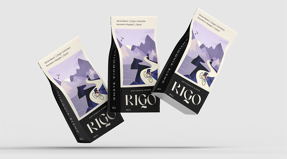
Antioquia Blend – Decaf
Colors:
Purple and Beige:
Reflect tranquility and relaxation, symbolizing the winding down of Rigoberto’s career.
Soft Purple: Suggests reflection, wisdom, and the peacefulness of his later years.
Warm Beige: Adds warmth and comfort, echoing the satisfaction of a life well-lived.
Landscape:
Showcases Antioquia’s mountainous terrain and a calm body of water, representing the beauty of his home region.

Software:
Created entirely in Adobe Illustrator, leveraging its precision and scalability for vector-based design.
Flat Design:
A minimalist approach with clean shapes, avoiding excessive detail to maintain a modern, geometric aesthetic.
Textured Details: Subtle grain textures applied to flat areas to add depth and visual interest without overwhelming the simplicity of the design.


Thank You!
RIGO’s packaging blends illustration and strategy to create a strong visual impact.
Thoughtful visuals can transform a product’s presence, and RIGO is a great example of how art direction brings a brand to life.
Appreciate you taking the time to check it out!
