Bruno
Caffetteria
Bruno Caffetteria
Art Direction, Branding, Packaging.
Clermont, Fl.
The Concept: A Visual Story of Bruno’s Legacy and Shared Moments
The art direction captures the warmth of Bruno’s life through nostalgic, and heartfelt illustrations. Every touchpoint—from packaging to posters—was built to reflect his journey and the timeless ritual of coffee shared across generations.
The Challenge:
Bruno Caffetteria needed a brand identity that felt intimate yet iconic—something that would stand out while preserving its emotional roots. The challenge was blending sentiment with shelf appeal and storytelling with functionality.
The Solution:
A character-driven illustration style was created to personify Bruno’s story. Paired with bold typography, textured print treatments, and a vibrant yet earthy color palette, the visual language evokes both tradition and modern charm.


Primary Illustration:
This illustration captures the emotional heart of the brand.
A warm embrace between Bruno and his granddaughter Tiziana.
It symbolizes legacy, love, and the passing of tradition across generations and continents.


Secondary Illustrations
The illustration system draws from mid-century charm with a modern twist—clean lines, bold silhouettes, and expressive characters. Inspired by Bruno’s story, the style is warm, nostalgic, and crafted to evoke connection through simple, human moments.


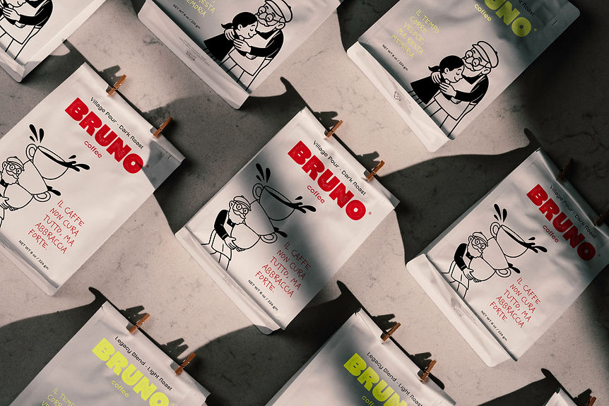
Packaging
Each blend in the Bruno collection is more than just coffee — it's a chapter of Nonno Bruno’s journey.
From bold rituals to quiet moments of rest, the packaging material, illustration, and color choices reflect his life and legacy: warm, handmade, and deeply rooted in connection.


Packaging Material
We used three distinct packaging materials to reflect Bruno’s story and coffee variety:
White paper bags for Legacy and Village Pour blends — light, bright, and crafted for Bruno’s daily tradition.
Brown kraft bags for Tiziana and Rituale — natural, earthy, and heritage-inspired.
Transparent bags for Dolce Legame and Riposo — minimal, modern, and perfect for showcasing whole beans with clarity and honesty.


Phase 1 - Intrigue
Tasting Pop-ups: Coffee served at weekend markets from a stand shaped like Bruno holding a cup. As people
reach through, it feels like he’s handing it to them.
Bruno in the Park: An illustrator dressed in Brunostyle wardrobe sketches locals, handing them personalized prints with a quote and QR code.


Phase 2 - Reveal
Bruno Cart: A hand-painted coffee cart in Bruno’s signature colors, featuring iconic illustration details. Post-launch, it becomes a mobile asset for pop-ups and local events—always sharing Bruno’s story, one cup at a time.
Bringing Bruno to Life:
A blend of print and digital visuals shares Bruno’s story—from carousel posts and animated coffee steam loops to printed posters and tasting stands. Unified by scent, music, and the message: Made to Be Shared.
Phase 3 - Invitation
Local creators receive a sealed envelope with a handwritten note from “Bruno,” a personalized coffee pack, and an invite. They share unboxings with the message:
“Bruno sent me something special… and you’re invited too.”
#madetobeshared


Thank You!
Bruno Caffetteria is more than a brand—it’s a shared story, passed down with every cup. Built with heart, designed with purpose, and always made to be shared.
